Overview
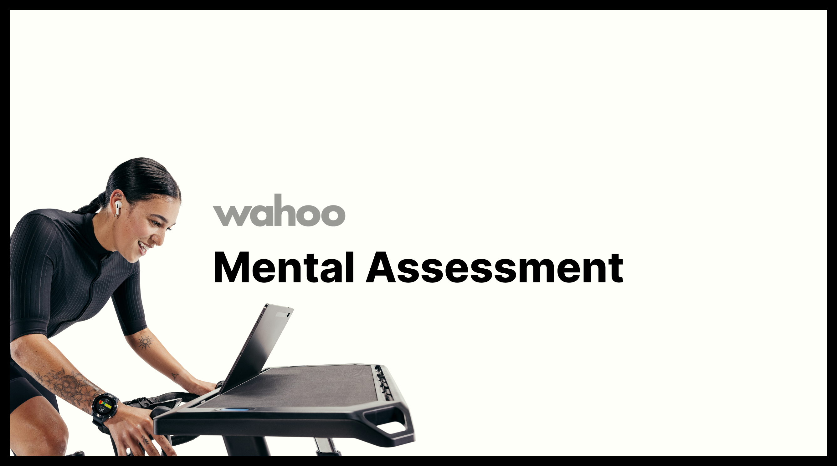
Wahoo could already tell athletes what their body did: pace, heart rate, power, training load. It couldn't tell them anything about their head. After Wahoo acquired a mental-performance data company, the question became how mental readiness could sit next to physical readiness without turning a workout app into a wellness quiz.
I led the design of Mental Assessment over three months, from concept through a tested prototype. The goal was something simple, measurable, and approachable: a 60-second check an athlete could do before training that produced a score they could act on.
The challenge
Introduce a brand-new kind of signal into a product that had only ever measured physical output, and make it feel credible rather than gimmicky.
What I found
Athletes trusted their own feeling over any score. Objective tests alone felt like being graded; self-report alone felt like a mood journal.
What I designed
A short self-check plus a go/no-go reaction game, combined into one Mental Capacity score that feeds the existing Training Capacity view.
The result
~85% of beta testers finished their first assessment, and 4 in 10 came back for a second within a week.
Key screens
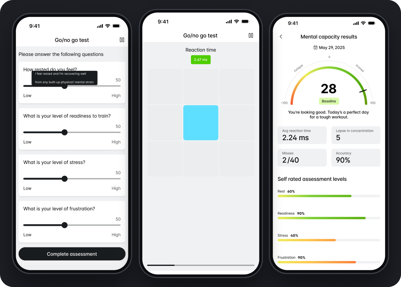
Check in, play for a minute, get a score you can train by.
The experience is three moments: a quick self-check on how you feel, a reaction game that measures focus objectively, and a result that combines both into a Mental Capacity score with a plain-language read on what it means for today's session.
1 · The opportunity
Wahoo knew the body. It didn't know the head.
Training Capacity already told athletes whether their body was fatigued or fresh. But every coach knows a rider can have fresh legs and a scattered head, and that the bad sessions often start there. The app had no way to see it, and no vocabulary for it.
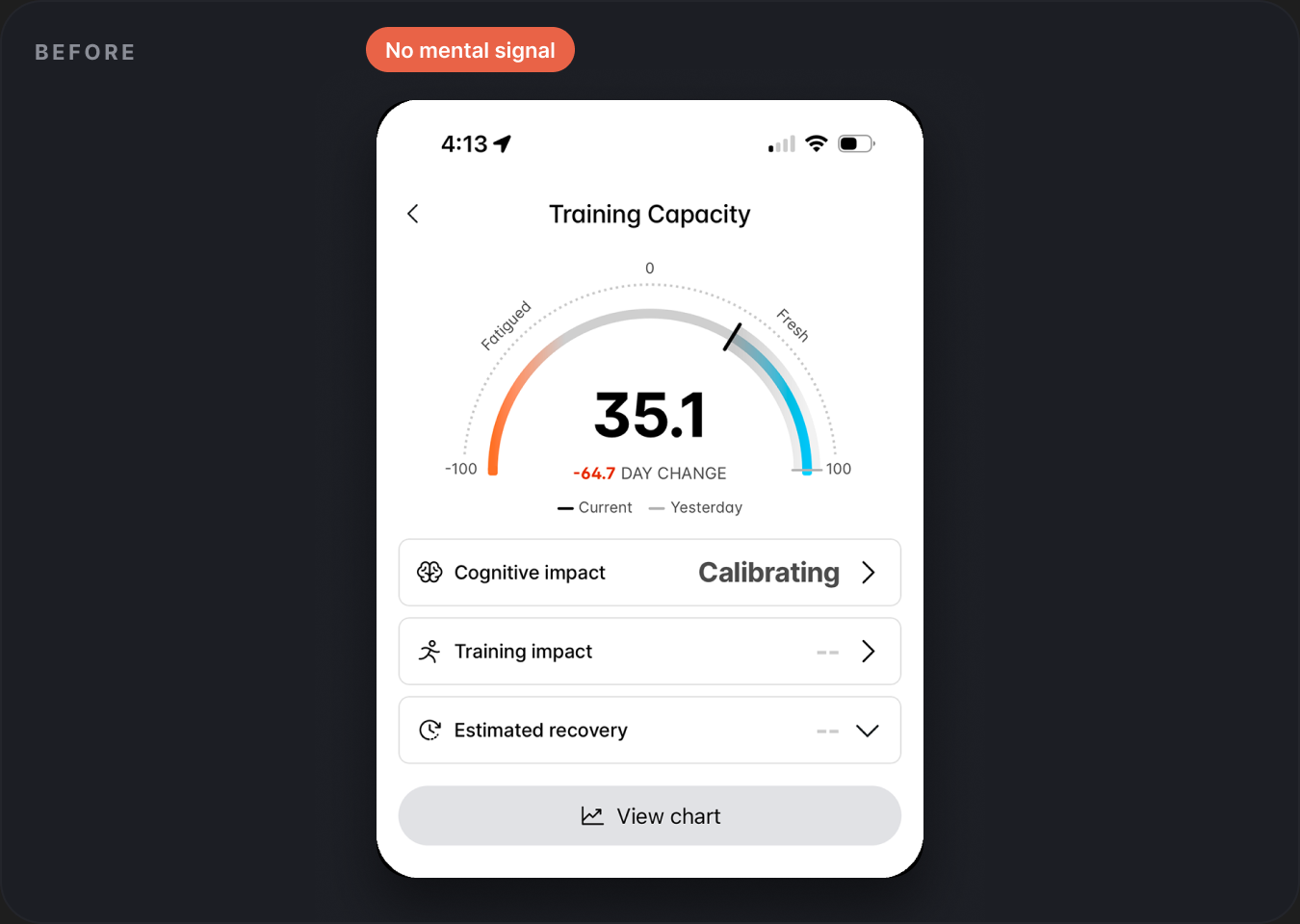
Then Wahoo acquired a mental-performance data company. That gave us a validated cognitive-testing method, but no consumer experience around it. The research version was a lab tool: long, clinical, and designed for a desk, not for someone clipped into a trainer five minutes before an interval session.
The opportunity
Reposition the app as more than a fitness assistant - closer to a complete performance companion that understands how ready you are, not just how much you did.
2 · What we heard
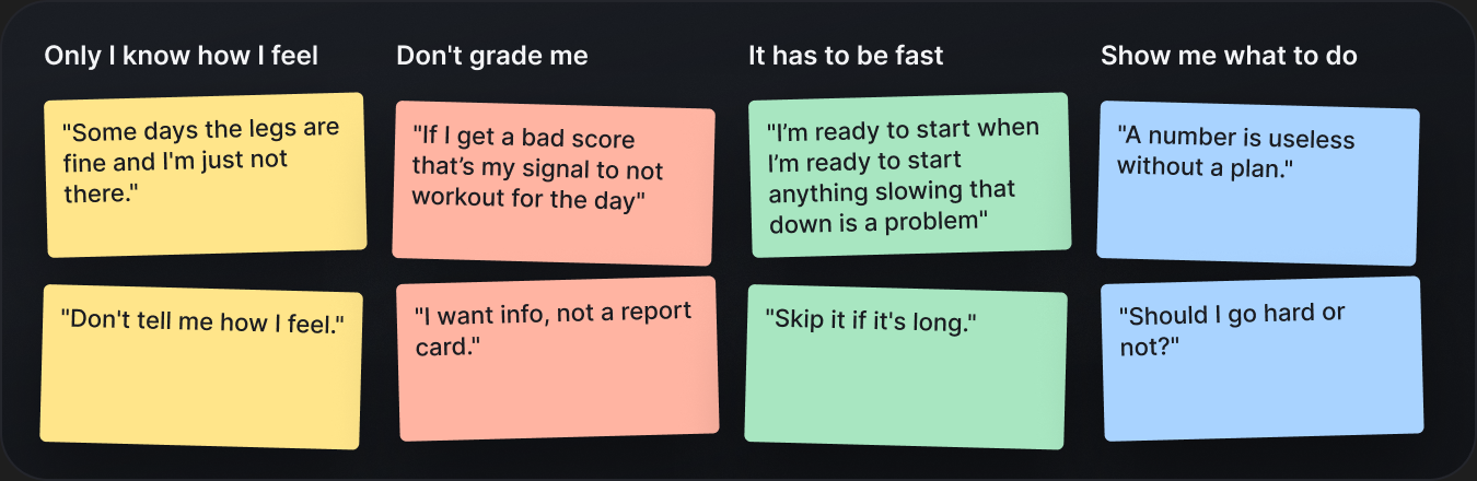
"Only I know how I feel"
Before designing anything, we talked to athletes about the days their training fell apart. The pattern was consistent: people could describe their mental state precisely, and they were wary of any tool that claimed to know it better than they did.
What research made clear
However you perform, only you know how you feel. No matter how simple the experience became, it had to always account for the athlete's own input - the score could inform their judgment, never overrule it.
That became the design principle for everything after: measure, but never without asking. It also set a hard constraint on time. If the check took longer than a warm-up song, athletes said they'd skip it.
3 · Finding the format
Three ways to measure a mind, one that felt fair
The biggest call wasn't the visual design. It was where the score comes from. Ask people and you get honest but noisy answers; test them and you get clean data that can feel like an exam.
Option A
Self-report survey only
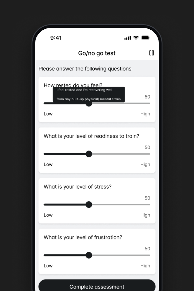
A handful of sliders before each workout. Fast and respectful of how people feel, but the score swung with mood and testers didn't trust it to mean anything measurable.
Option B
Objective cognitive test only
The research method, trimmed down. Credible data, but testers described it as "being graded," and a bad round with no context felt like the app telling them they were having a bad day.
Self-check plus a short game, one score
A 20-second self-check, then a go/no-go reaction game, blended into a single Mental Capacity score. The athlete's feeling is always part of the result, and the game gives it something objective to stand on.
Option C won because it respected both kinds of truth. The self-check kept athletes in charge of how they felt; the game kept the number honest. Together they produced a score testers were willing to plan a session around.
4 · Designing the test
Making a cognitive test feel like a warm-up
A measurable game
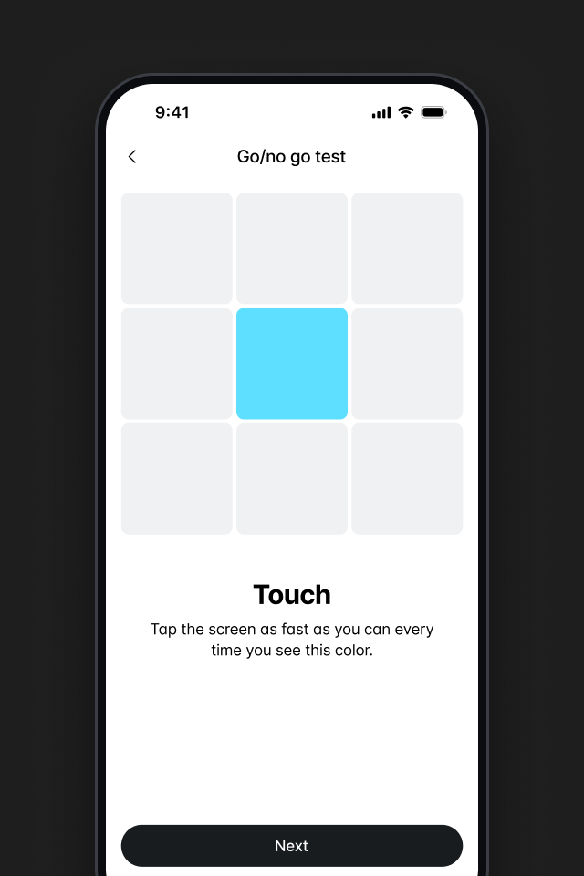
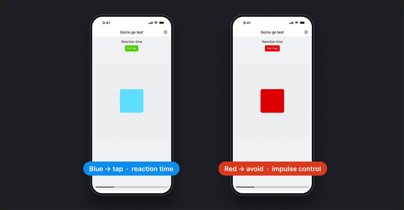
Instead of framing the experience like a form, I built it around a go/no-go game: tap when the target is blue, hold when it's red. It measures reaction time, lapses, and impulse control in under a minute, and it feels like a warm-up rather than a quiz.
A simpler interface
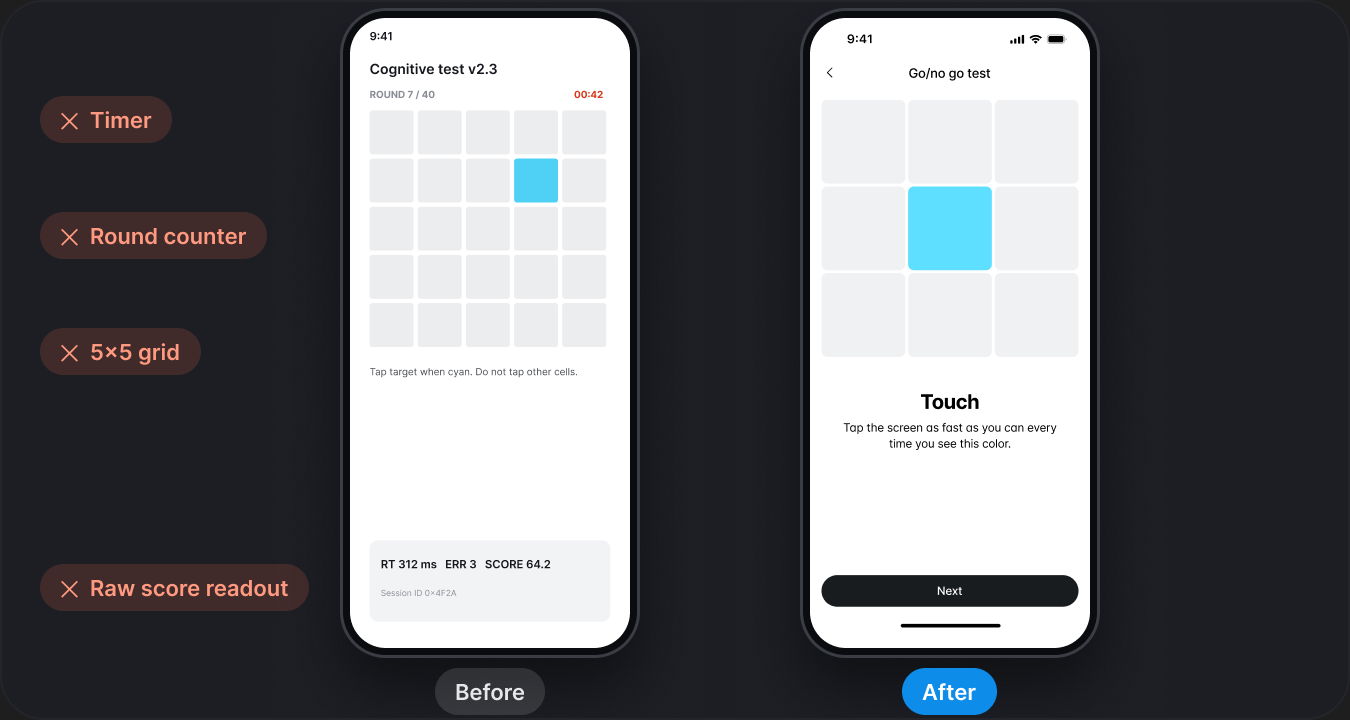
I stripped the test screen back to one grid, one target, one instruction. No timer, no round counter, no running score. Everything an athlete needs is readable at arm's length on a phone clipped to the handlebars.
Reduced precision demands
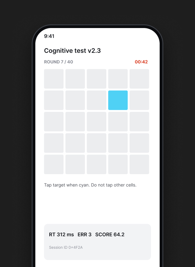
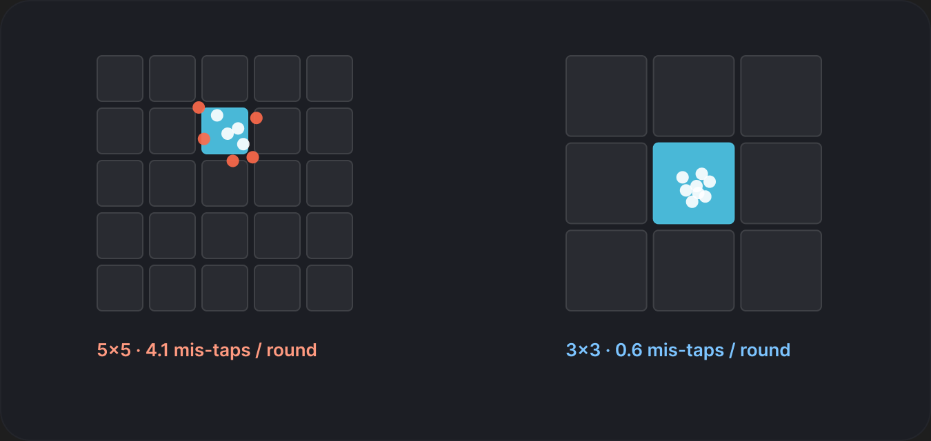
Early prototypes exposed a real problem: small touch targets meant athletes were being scored on their aim, not their focus. I moved from a 5×5 grid to 3×3 and made each cell a full tap zone, so the test asks less of the body and measures more of the mind.
5 · Making the score land
A number athletes would actually train by
A score only matters if it changes a decision. So the work didn't stop at measuring - it was about how the result was framed, how much to trust it on day one, and where it showed up next.
Inform, don't judge
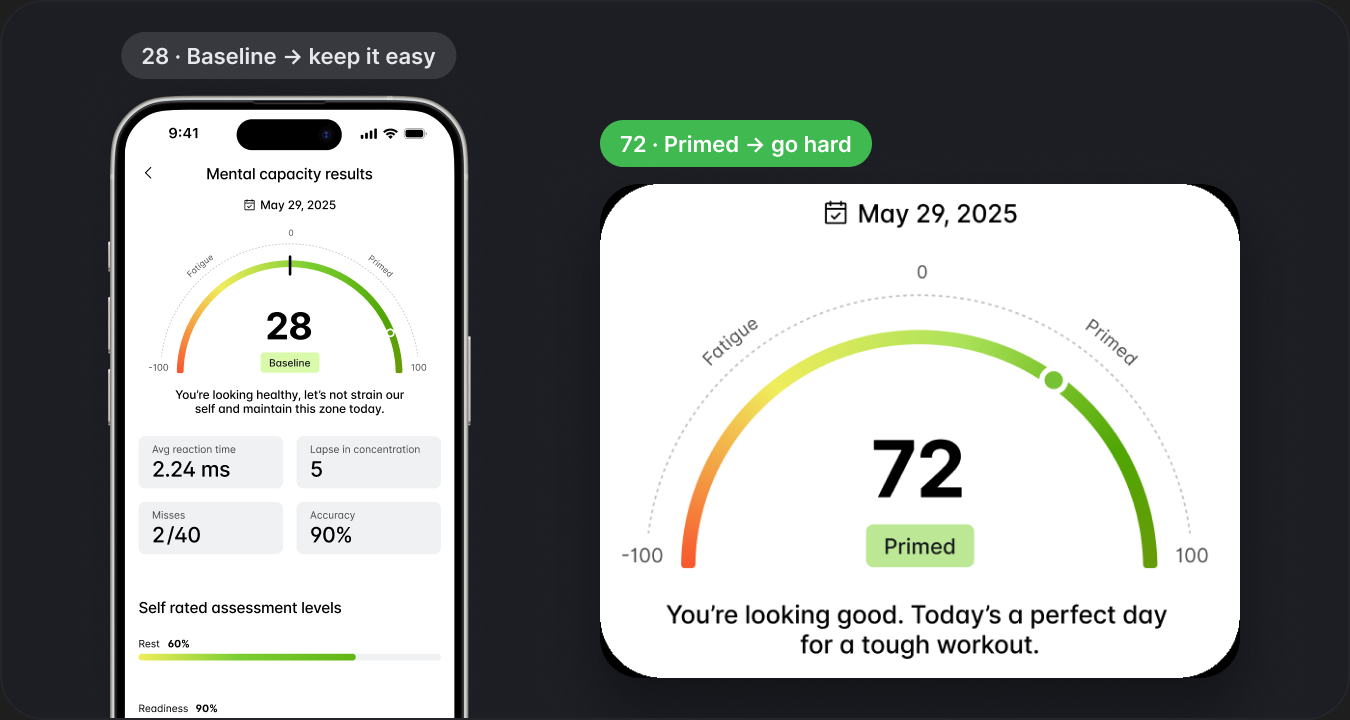
I replaced raw pass/fail language with a gauge that runs from Fatigued to Primed, paired with a plain read like "You're looking good. Today's a perfect day for a tough workout." Low scores get guidance, not alarms.
Earning trust with a baseline
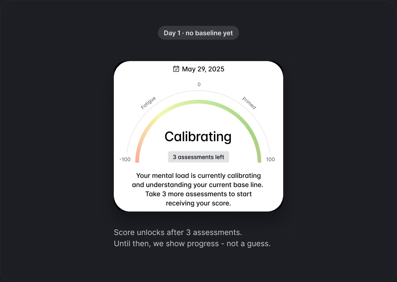
A score of 60 means nothing without knowing your normal. The first few assessments build a personal baseline, and the UI says so honestly: "Calibrating - 3 assessments left" instead of showing a number we can't stand behind yet.
Seeing the trend, not just today
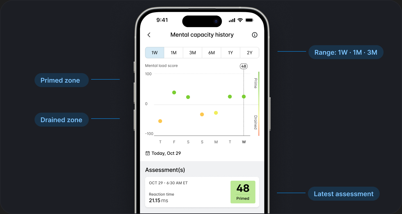
One score is a snapshot; the value is in the pattern. A history view plots each assessment over weeks so athletes can see how sleep, stress, or a hard training block shows up in their head before it shows up in their legs.
6 · Edge cases
Getting it right beyond the happy path
The moments that don't show up in a demo, but decide whether people trust the feature after week one.
When you miss
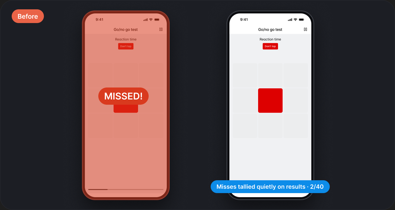
Early versions flagged misses with abrupt red feedback, which clashed with the reflective nature of the feature - one slip and the whole check felt like a failure. I dialed those moments back so a miss registers quietly and the round keeps moving.
Not relying on color alone
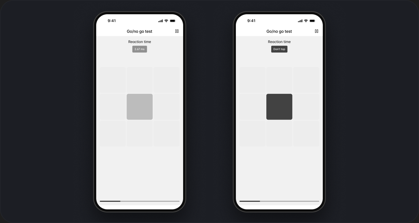
Go/no-go is built on blue versus red, which fails anyone with color-vision deficiency. Every target also carries a text label - "Tap" or "Don't tap" - so the test measures attention, not eyesight.
Early workout to late
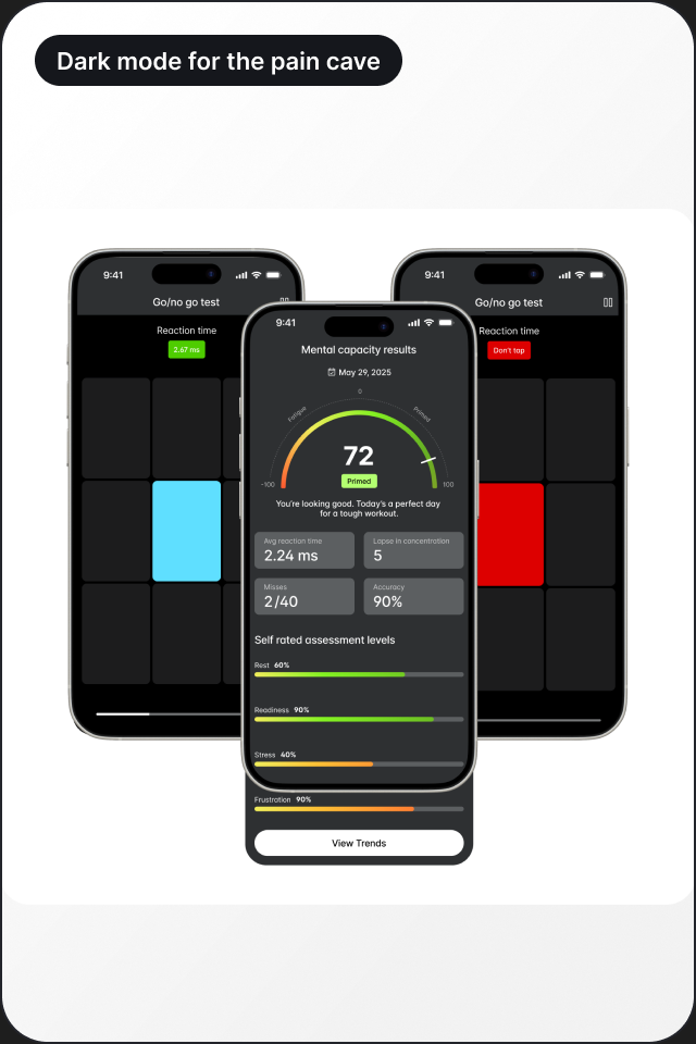
Most assessments happen with the phone mounted on handlebars in a dim pain cave. A dark test mode keeps the targets high-contrast without blinding a rider mid-warm-up, and every tap zone works with a gloved or sweaty thumb.
Thanks for reading
If you'd like to talk about this project, the decisions behind it, or anything else in the portfolio, drop me an email.